Showing posts with label Environmental Design 1. Show all posts

Wednesday, December 8, 2010

FINISH LINE.

Thought it would be fun to put up the progressive photos of all of my projects from Environmental Design. It's interesting and uplifting to see the improvement over the semester.


Peeking in on the 2nd Years.

For Environmental Design, we were asked to sit in on the presentations of our upper class peers, in order to get some pointers and learn about what to expect as we move through the program. I sat in on the presentations of the second year students.

Things I definitely took note of were their confidence in their own ideas, the professional way that they were dressed, their ability to think on their feet.

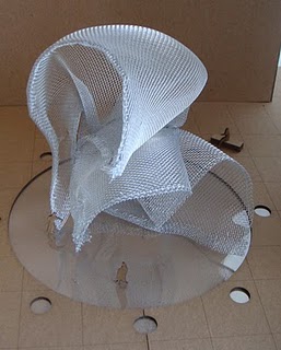
I particularly liked Jasmine Jone's project, in which she incorporated specific points in her hand to help create a structure that would stand in the middle of a plaza, such as Columbus circle.

She chose five points on her hand and used these to weave a thread like wire through a mesh screen. I was impressed that she put so much thought into the fine details of the project.

I liked her project mostly because of the thought and trials she went through to get her object to come out exactly as she wanted. We can all relate to "failures."

Her object looked like a cloud of smoke rising into the sky from the concrete surface beneath it, really beautiful and mysterious. Something one wouldn't expect to see in the location that it was to be placed.

Here are some photos of her project:


The Light at the End of the Tunnel.

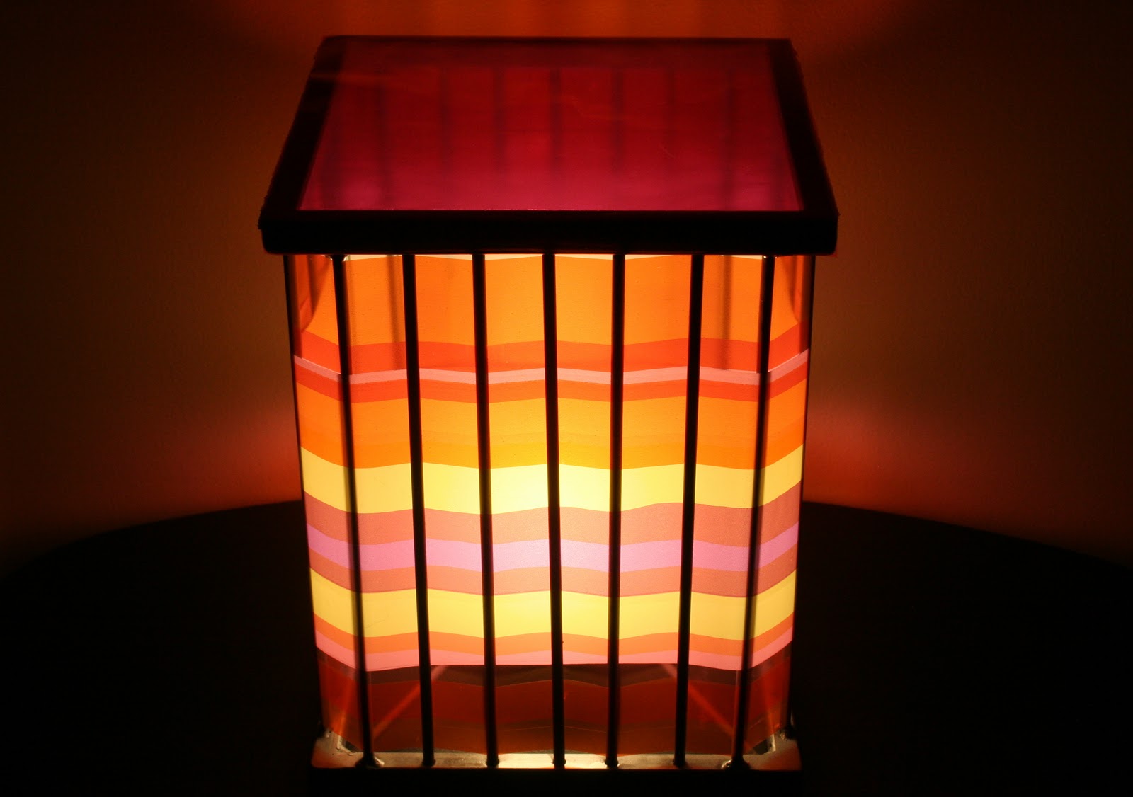
After much hard work and tireless efforts, we finally presented our Luminaire projects this past week. I'm so pleased with how mine turned out. It was successful in creating the ambiance that I was going for, giving the room it's in a glow, transforming the space, much like the stained glass, that was my original inspiration, did.

Here are some photos of this little lights journey.

Building the original prototype.

Using the first prototype in my studio!
First prototype.


 Here are some photos of the final product:


Sunday, November 14, 2010

LUMINAIRE.

Just some updates on what is happening in my world right now.

We recently had our first critique of the luminaires that we have been constructing. I was overall pleased with mine. Obviously, modifications are in order and are already underway. I am trying to capture the effect and transformation that light through stained glass can have on a space without literally recreating the actual circumstances.

The beginning of my prototype.


What the final prototype ended up looking like.

Beginning of my next model, this time metal instead of wood.

Thursday, October 28, 2010

HAILEY VS. A 2x4.

In Environmental Design, we were taken down to the wood shop, handed an 18 inch 2x4 and told to create a system. Every piece of the 18 inch piece had to be used, meaning if you cut a piece off, it had to be incorporated in your project as well. Only the sawdust could be thrown away. Those were the only guidelines or discussion about the project we received. In case you have never worked with a piece of wood in your life, let me assure you, there was not much to work with. 

I knew I wanted to create something functional, something that I could use here at my desk in the studio and that I wanted to use dovetails to do it. I figured there was never a better time to practice than now, when I have to do it anyways.

So I came up with this simple "bookshelf" design. A system of two sides, three shelves, two cubby holes, and a drawer at the bottom. And for the record, we were not allowed to use any adhesives or binding agents, meaning no nails. This entire project is held together through the dovetails and a series of wooden wedge pegs.

Below are the photos of the finished project:

Front view.

Side view.

Back view.

Drawer partial view.

Drawer separate view.

The dovetails proved to be just as difficult as I had anticipated, getting the angles just right for the fit was next to impossible. This is definitely a technique that I want to improve on, for when I make larger scale pieces in the future, but overall I'm pleased with how this ended up turning out.

Tuesday, October 26, 2010

NOTEWORTHY ARTIST: Marcus Tremonto

What is light?

Such a broad question, with many possible answers, but my favorite amongst them would have to be a quote from Michael Strassfeld:

Light gives of itself freely, filling all available space.  It does not seek anything in return; it asks not whether you are friend or foe.  It gives of itself and is not thereby diminished. 


The piece featured above is by an artist by the name of Marcus Tremonto. An American light designer, Tremonto is often called, "a magician of light." Many of his works feature manipulated strands of cool burning electroluminescent wires, which he molds into both traditional and abstract shapes.

The most intriguing thing about his works to me is their overall aesthetic, how they seem to glow with the fluorescence of neon yet consume little to no power to operate. I also enjoy the way that in some of his works, particularly the installment he did in the Paper Landscapes series, how he draws "inspiration from outdated technologies used to generate topographic digital landscapes."
The fact that this artist has somewhat of a sense of humor is also very refreshing for me. This side of his work can be seen in a somewhat recent collaboration that he did with MUNNY. Seen below.


In terms of comparison to another light artist, I believe that Marcus Tremonto most similarly resembles artist, Dan Flavin. Each of these artists captures light in a way that gives the essence of neon fluorescent lights. However, Flavin tends to take a much more symmetrical approach when constructing his works. Their works can be compared below.

Dan Flavin
Marcus Tremonto


Sunday, October 17, 2010

SEEING THE LIGHT.

Once upon a time, for our Environmental Design class, we were appointed the task of finding and observing a phenomenon of light. As previously posted, I decided to do stained glass since it ran so many parallels with what we were discussing in my other classes and I generally just like stained glass.

Stained glass windows from the First Presbyterian Church, Elm St. NC.
I chose this photo because of the location of the windows and the way that the light shined through them and played off of the enormous steel organ below. It created a beautiful scene, the light not only danced on the organ but on my skin and the walls around me as well. It literally transformed the room into sort of a dream, which is the main focus of my project, the transformation of light.

This is what the final board ended up looking like.
Here is the actual board, at the top an interesting quote by Elisabeth Kubler-Ross I found that reads:

"People are like stained glass windows, they sparkle and shine when the sun is out, but when the darkness sets in their true beauty is revealed, only if there is a light from within."

The model beside the actual photo is a replica I did of the window, with an actual light behind it. The diagrams you see below those are my interpretation, after conversing with Tommy, of the transformation of light from all the colors in the spectrum to the single color that the eye sees. 

Yes, the window actually lit up.

Tuesday, October 5, 2010

Let There Be Light.

For our studio class, we have to capture, explain, and portray a phenomenon of light. In my History and Theory class, we have been talking about the cathedrals of the Gothic style period. So when deciding what my light phenomenon would be I "saw the light" you could say. Stained glass! I've been in love with stained glass since I was small and I think the presence that it can create in a room is spectacular. 

Recently we attended a lecture by Seth Riskin, whom I have blogged about rather recently, and he used a particular quote, 

"Light as an extension of god."

I found this to be such a powerful concept, light encompassing and portraying the divine, how could I not use that in my project?

Anyways, here are some photos I found of stained glass. None of which I will use on my actual project, that part is a secret until Friday.

Enjoy.


Sunday, October 3, 2010

A Place For Twelve Twigs...

When we were first assigned this project, I was ecstatic. Although, I love designing things on paper, building models and other items is where I think I really shine. After much trial and error, I was so pleased with how my place for twelve twigs turned out. The first photographs are of the finished product and those following are of the many ideas that didn't quite make the cut.
Front view of the final product.

Side view of the final product.

Close up frontal view of the final product.

Close up of woven sticks of the final product.
When it came to designing this piece, it really had to do with my personal preference. My design taste exists on the most extreme of each side of the spectrum. I am a big fan of modernism, with very clean lines, nice angles and little color. However, I am also in love with the ornamentalism and fantasy movements, featuring spaces such as Philippe Starck's, Ramses Restaurant and SLS Hotel. I don't dabble much in the in between.

My earlier pieces are much more inclined towards the latter of these movements, but after much contemplation I decided simplification was the key to success in this situation. I wanted a place to showcase the sticks, without any funny business around it that might take away from the purity of these natural elements existing amongst modern materials. I wanted the viewers eye to be immediately drawn to the center of the piece, where the sticks are housed in their woven pattern, then allow themselves to wander about the rest of the project, appreciating its simplicity.

The following photos are from early on, when my ideas were still swirling above my head like a helicopter trying to find a safe place to land...

The first try at stick weaving, which proved to be much more difficult than originally anticipated.

Dabbling in exterior painting techniques, before I decided on the simplicity of a plain white exterior.


 Everyone called this piece, "the jungle gym." Which is what it was, a jungle gym of ideas. Through which I found the central idea that I wanted to focus on, and proceeded forwards.

The first model of the basic shape of what turned into my final project.

Thursday, September 9, 2010

Environmental Design 1: Assignment One

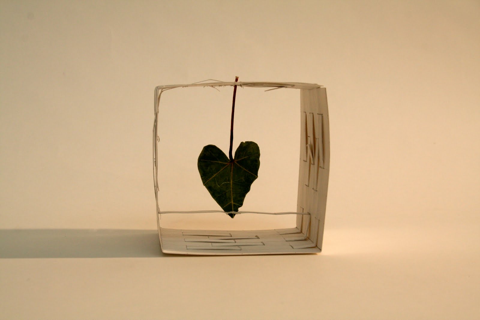
The journey to my place for a leaf began very differently than it ended. My initial thoughts were, what better place for a leaf than a tree? The thought of using only paper and no binding agents was very difficult to wrap my mind around since I had never really built anything serious previous to this assignment. My biology roots did not prepare me for the hours of cutting, tearing, and folding that would ensue. But after all of the work, I must say I am very pleased with the final product.
Photos of the final product:
 The tree, mentioned earlier, although a lovely idea did not turn out as I had originally anticipated. I wanted the final product to be more simplistic, more about the leaf than the paper itself. I wanted to have the leaf suspended, creating an illusion that it were floating inside the box. The bar across the bottom was for stabilization purposes. More of a necessity than aesthetically pleasing.

Original Idea
Original Idea