To my teachers:
Thanks so much for everything you have helped me achieve this semester. It was a rocky start, I know but I look back on the progress I have made throughout the semester and even the year and am amazed at how far I have come. I know my drawing technique and everything else still need many, many, many more hours of work but I think with the time they could be really great and hope you recognize the progress I've made. So again, thank you for everything and I hope you all have a wonderful and relaxing summer.
All the best, Hailey

Showing posts with label Environmental Design II. Show all posts
Showing posts with label Environmental Design II. Show all posts
Monday, May 2, 2011


WRITERS RETREAT.
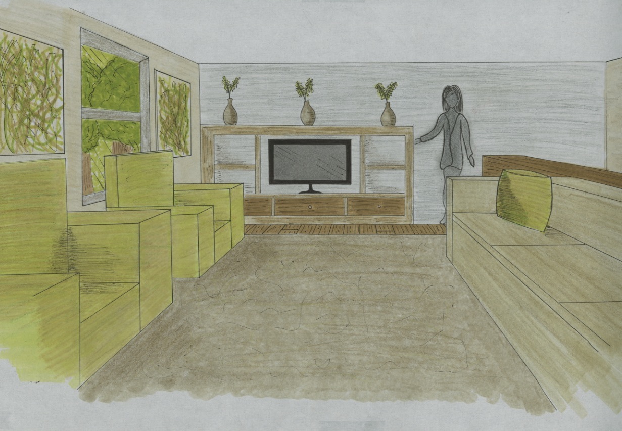
I have blogged previously about Saint Mary's House, the house we were given to change into the home away from home for a traveling writer.
First we were split into multiple groups which took care of all the basics such as measuring the building, collecting the history of the neighborhood, collecting the history of the house itself, and the history of the writing program to which it would house.
Once floor plans were drawn, we were given pretty much free reign on how to manipulate the space as long as it included the following: bathroom, living space for the writer, meeting space, public reading area, reflection area, and parking.
The themes for my space were layers and literature.
I wanted to appeal to the writer on all the layers of their individuality. As a writer, as a person, as a teacher and colleague, and as a speaker and presenter.
I chose to include many, many bookshelves, because I think reading is as important to the writing process as the writing itself.
I also chose a lime zest green to be the theme color for the space because I know how it feels to be burnt out after many hours of work and I wanted a color that would invigorate and inspire the mind and senses.
Here are some photographs of what the final boards ended up looking like:



DINING SPACE FINAL PROJECT.
After many tedious hours of composing my final Dining Space project, I can finally say that it has been completed. I was pleased with how it turned out but even more pleased with what a great leap the level of craftsmanship was in comparison to when I first entered the program.
I wanted to create a space for people to gather that was somewhat unconventional, allowing them to bond over the unusual, since in the scenario we were given, the guests would not have been previously acquainted. I chose purple to be the main color of the space because it evokes a sense of royalty and importance. Clean lines, nothing too busy, clean but interesting.
Here are some photos of the final drawings:
Here are some photos of it on the wall during presentations:


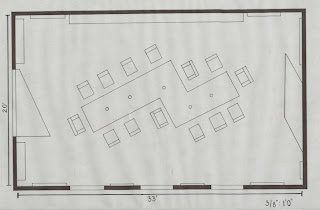


I wanted to create a space for people to gather that was somewhat unconventional, allowing them to bond over the unusual, since in the scenario we were given, the guests would not have been previously acquainted. I chose purple to be the main color of the space because it evokes a sense of royalty and importance. Clean lines, nothing too busy, clean but interesting.
Here are some photos of the final drawings:
Here are some photos of it on the wall during presentations:


Wednesday, April 6, 2011
FALLING WATER.
This past weekend, the first year program took a little field trip across four states in two days in the name of architecture. We went and toured Monticello, Thomas Jefferson's ever changing home in Virginia, the University of Virginia itself, and then went up to Pennsylvania to have a look at Fallingwater.
As a somewhat gray area mandatory/optional blog post, we were asked to choose our favorite of these and tell you why.
I chose Fallingwater.
Why Fallingwater, you ask? Well, I'll tell you. I just fell in love with the connection that this house has with nature. From the steps down into the river, to the walls of windows, to the balconies, to the incorporation of the natural stone into the entire house....I loved it all. I really appreciated the amount of thought Frank Lloyd Wright put into every single inch of this home, so much thought went into the home, he just had no time left to consider budget. I thought it was a really interesting concept that Wright firmly believed in never, ever blocking a window. The desks in the bedrooms were even cut out so that you may open the window without bumping into furniture.
The stone of the floor was also really, really beautiful. The way it came up out of the floor into the living space at the fireplace was so pretty. He really thought about how people would interact with the space but most importantly how people would interact with nature, through the space.
Here are some photos the interior so you can begin to understand what I'm talking about.


As a somewhat gray area mandatory/optional blog post, we were asked to choose our favorite of these and tell you why.
I chose Fallingwater.
 |
| Kristy and myself with Fallingwater in the background. |
Why Fallingwater, you ask? Well, I'll tell you. I just fell in love with the connection that this house has with nature. From the steps down into the river, to the walls of windows, to the balconies, to the incorporation of the natural stone into the entire house....I loved it all. I really appreciated the amount of thought Frank Lloyd Wright put into every single inch of this home, so much thought went into the home, he just had no time left to consider budget. I thought it was a really interesting concept that Wright firmly believed in never, ever blocking a window. The desks in the bedrooms were even cut out so that you may open the window without bumping into furniture.
The stone of the floor was also really, really beautiful. The way it came up out of the floor into the living space at the fireplace was so pretty. He really thought about how people would interact with the space but most importantly how people would interact with nature, through the space.
Here are some photos the interior so you can begin to understand what I'm talking about.


Tuesday, March 1, 2011
THREE PRECEDENTS.
Before we got down to business thinking about our dining spaces, we had to do some research, coming up with three precedents. The purpose of these is so that we could experience and relate to the work of those that have come before us. We had to choose a spiritual, social, and dining space.
For my Spiritual Space, I chose the Garden Courtyard from the Sanderson Hotel in London. This space was designed by Philippe Starck. I chose it for the way he uses candlelight to create intimacy.

For my social space, I chose a location from the very same hotel as before, the Sanderson Hotel. This is what is commonly referred to as the Purple Bar. I also chose this for the lighting.

For my dining space, I chose my favorite restaurant to date, The Ramses Restaurant, designed by Philippe Starck. I love the quirky elements that can be found throughout the restaurant, creating an importance of the experience of the unusual.

For my Spiritual Space, I chose the Garden Courtyard from the Sanderson Hotel in London. This space was designed by Philippe Starck. I chose it for the way he uses candlelight to create intimacy.

For my social space, I chose a location from the very same hotel as before, the Sanderson Hotel. This is what is commonly referred to as the Purple Bar. I also chose this for the lighting.


Monday, February 21, 2011
NARRATIVE.
We had to write an introduction to our dining space, some sort of story about why these people are coming together as they are...so, being a former English major and fanatical writer, I got really cheesy peezy with this, enjoy!
The guests ascended the stairs to the large old house in an orderly and cautious fashion. All members of high rank in society, all from different parts of the world, these strangers had nothing in common except one unknown similarity, they each were making strides within their local communities to eradicate hunger. Standing at the large, heavy wooden door they glanced around at one another with curiosity. Each had received a strange invitation, bidding them to come to the northern part of Washington, for an unforgettable meeting in the name of their cause. Plane tickets and lodging were provided and an evening they would never forget was promised. Suddenly, a lock turned and a small balding man in a tuxedo was standing at the door. Welcome, she’s been expecting you.
As they flooded through the door, they were greeted with a house like they had never before seen. Old, with elegant finishes, full of rich tones and textures. As the butler took their jackets, more men in tuxedos appeared. They ushered the guests towards two large double doors. As the doors opened they were met with a dining room so spectacular that small gasps could be heard throughout the group. The walls were bathed in purple fabric, dimly lit by a two heavy black chandeliers and a series of candles set into the table. The table! The best part of the entire room, zig-zag in shape and surrounded by a series of different seating. Large, plump purple armchairs, normal dining chairs, and a series of benches surrounded the table. The wall of the room was covered by the ivory of a series of skulls, all with mirrors in the eyes sockets, providing a reflection of the candlelight. On the silver china sat small envelopes with each guests name. This would be an evening that they would never forget.
PARTI, PARTY. LET'S EAT!
Here we have my parti, or collection of ideas, for the dining space we are currently designing in studio. As you can see, it's dark, mysterious, and a little unorthodox but hey, that's kind of me in a nutshell.


SOCIAL MEDIA.

Here, ladies and gentlemen, we have a quick little project that we did for studio on social media. We were asked to design an in home object that facilitates and encourages the use of social media. I came up with a table, with a built in interface, somewhat like a Microsoft Surface.
The table is one of the most central locations where a family comes together, so my inspiration was staying connected with the world without disconnecting with the ones you love.


The LED screens would tilt in and out, being about bar height, to allow the user to browse the web easily but also enable them to access the tabletop as well. Also, if someone found something interesting, with just a swipe of the hand, the video or image can be brought and enlarged on the tabletop for the entire family to view.
Thursday, February 17, 2011
Severely Malnourished
It has been brought to my recent attention that I have paid little to no attention to my poor little blog this semester. It has remained un-updated and uninformed for many weeks now. Apologies to anyone who regularly checks it to see what I'm up to....that means you, mom and dad.
So, some things to look out for by the end of the week:
1-Value Study project for Design Visualization
2- Social Media Table Project and Parti for Environmental Design
3- Dining space for Environmental Parti and sketches
4- Material Study for Design Visualization
Big things are coming, people, big things!
And for the sake of graphics, I leave you with a photo of my favorite designer, my inspiration:
Philip Starck.

Monday, February 7, 2011
Babette's Feast
In the film, there was certainly a defined culture existing within the small community in which Babette lived. They were extremely conservative and this reflected into the way they spoke, dressed, and even interacted with the other members of the community. Their conservative values reflected in the design of the modest clothing that they wore and the polite way in which they went about their daily activities. The designs existing within Babette's home were modest yet had a sense of elegance, made to make guests in the home feel comfortable without being overwhelming.
The refined behavior and design existing within the film are just one example of the relationship between design and culture. The culture from which a person comes defines their entire lives and how they exist within that life. Therefore, the design of these places must reflect and parallel with the culture for which it has been designed. If a person comes from a very conservative culture, such as Babette, chances are the designs of the clothing and interiors of this place will also be conservative in nature. If a person comes from a culture of luxury, they most likely will have things designed to surround them that reflect these values and so on.
You cannot design for a person without first knowing and understanding the culture from which they come. Plain and simple.
Monday, January 31, 2011
ROY G. BV
This past week in studio has been what was excitedly referred to as color week. In a less kindergarten fashion, what this means was that we were hands on learning how to see and experience color.
This also means that we had to race against our studio mates, spilling blood and squealing tires, to purchase one of the golden tickets, a pack of fifty to seventy dollar Color Aid paper.
With paper in hand, we went to work, cutting and re-cutting....and re-cutting this paper so that we could compare and re-compare....and re-compare again.
We had various assignments due as the day ticked by, which I will discuss along with a visual aid that I have provided below:
The first assignment (the square of three colors) was merely that, a square of three colors, meant solely to train our eyes to be able to see the glow emitted when these colors are put side by side. The next two, (the cross and the triangle) were meant to be exercises in the mixing of two and three colors. The palette, which we were told are our babies for the rest of the semester, are colors we chose and their various mixes of which we will have to use in later projects during the semester. The next (the five square wonder) was an exercise in the mixing of a single color with four different colors. And finally, at the bottom, we were asked to create our abstract interpretation of the four seasons of the year using the colors from our chosen color palette.
This also means that we had to race against our studio mates, spilling blood and squealing tires, to purchase one of the golden tickets, a pack of fifty to seventy dollar Color Aid paper.
With paper in hand, we went to work, cutting and re-cutting....and re-cutting this paper so that we could compare and re-compare....and re-compare again.
We had various assignments due as the day ticked by, which I will discuss along with a visual aid that I have provided below:
 |
| My work, hung proudly on the wall. |
 |
 |
| The color wall. |
What It Takes To Know: My Manifesto.
The term manifesto is simply defined as: a declaration of ones intentions.
What our intentions are is often governed by the beliefs and values that we already have established and pursue in our daily lives. Where do these beliefs and values come from? From things we know, what we've been taught, and how we feel.
All design, in my opinion, stems from these things and in an ever moving world, the ability to be completely and totally original has become somewhat obsolete. However, I think it is extremely important in the design process to take and apply what you already know into what you are producing. As Nigel Cross states in his, Designerly Ways of Knowing, that, "the natural intelligence in design that is possessed by good designers, in fact to some extent is possessed by all of us."
Aside from what we know, we must then understand or at least make an attempt to understand a sensible process from which the ideas go from our brain into the physical world. This can only be done, no matter what anyone tells you, through trial and error. A designer must be willing to accept failure, multiple, multiple failures before that ray of light seems to crack through the clouds of the hurricane. We learn as we go and understand more about the task at hand as it begins to unfold before us. Richard Cormac, an architect, understood this when he stated:
I don't think you can design anything just by absorbing information and then hoping to synthesise it into a solution. What you need to know about the problem only becomes apparent as you're trying to solve it.
So you see, it's quite simple but extraordinarily complicated simultaneously. It is a matter of learning how to weild the rope that will allow you to lasso an idea out of the sky, bring it down to earth, and make it something real, tangible. As a designer you have to understand that you will not catch the unruly idea the first time, maybe not even the second or third but that if you believe in yourself and your work, great things are bound to happen.
Sunday, January 30, 2011
So, Veins It Was.
For our very first assignment of the new semester, we were asked to create an illuminated box that followed these criteria:
Using a remote light source that shines through a series of openings in the box, create a pattern of light within the box that divides the space into four parts.
Quite frankly, I took a very violent approach to this, stabbing said box with an exacto knife until I came up with a pattern that I thought was interested. Funny enough, what I came up with reminded me of the human vascular system, illuminated within the four walls. Veins crept all over the walls and sides of the box, crawling, living, moving, desperate to be seen.
So, veins it was.
I knew that to create this effect, very precise lighting would be needed. I decided upon conjuring up a contraption to not only house the beautiful stained glass bulb I found conveniently at the Home Depot, but to also ensure that no matter when, where, how, that light would always be in the same place.
I must say, that I am so proud of how this project turned out in its final stages. I feel like this breathed new life into my design and was a giant leap forwards into the unknown of the type of designer I will become.
Here are some photos of the final project:


Who's Talking In Great Britain?
For our Environmental Design class, we were assigned a country and asked to research the social media in that country.
I got lucky in the drawing hat and came out with Great Britain.
Now, Great Britain is one of the most civilized and media forward countries in the world and is, "among the top ten countries for Internet penetration rates. At least 50% of UK households have broadband internet, and many use mobile phones to access broadband internet."
Aside from the United States, Great Britain is one of the highest internet trafficked countries in the world. A March 2010 article claims 30 million Brits are using social media. This means more than three quarters of the UK’s online population use social networking sites such as Facebook and Twitter." Each Brit on these sites also has on average 173 friends in comparison to the world average of 130, and has an average log in of twice per day.

- 85% of the UK is now online.

And just because I love you, Great Britain in pictures:
I got lucky in the drawing hat and came out with Great Britain.
Now, Great Britain is one of the most civilized and media forward countries in the world and is, "among the top ten countries for Internet penetration rates. At least 50% of UK households have broadband internet, and many use mobile phones to access broadband internet."
Aside from the United States, Great Britain is one of the highest internet trafficked countries in the world. A March 2010 article claims 30 million Brits are using social media. This means more than three quarters of the UK’s online population use social networking sites such as Facebook and Twitter." Each Brit on these sites also has on average 173 friends in comparison to the world average of 130, and has an average log in of twice per day.

I also found this interesting video about social media in the UK:
Here are some of the finer points of the video above:
- 85% of the UK is now online.
-1/3 have uploaded to a video sharing site.
-1/4 write blogs, while 60% read them
-64% of them have their own profile on a social networking site
-29.4 million have visited at least one social networking site, in ONE month
The UK is also leading the way in terms of Universities communicating with their students. "More than 60% of all university twitter followers are connected to UK institutions. They also account for 42,4% of all Facebook members. The University of Oxford dominates both Twitter and Facebook and is growing at a great velocity of around 2.000 members every month."

And just because I love you, Great Britain in pictures:
http://www.socialmediadelivered.com/2010/07/21/social-media-tendencies-around-the-world-the-uk/
http://mashable.com/2010/07/28/social-media-uk/
http://www.scienceguide.nl/201012/top-10-of-social-media-in-he.aspx
Subscribe to:
Posts (Atom)